
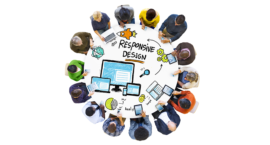
With responsive design, your employees can take their learning wherever they go. Made to meet the ‘anywhere and anytime learning’ demand for mobile device users, responsive design is the latest standard of developing learning content for today’s mobile workforce.
Every other executive and manager in today’s business is often on the move. Meetings, presentations, conferences, and webinars frequently keep them busy. They also have to take the time to share their ideas with colleagues or mentor other associates.
However, they have their own share of learning to accomplish, which includes learning on the intranet or other online platforms. Given the busy schedules of the learners, their dependence on mobile devices for ‘anywhere and anytime’ access to online resources is inevitable.
In such a scenario, it is imperative for learning content to run consistently across diverse mobile operating platforms, such as Windows, Android, iOS, etc. The learning industry’s solution to this need is responsive design, which means that the ‘look-and-feel’ and functionality of learning content across devices is retained, yet repurposed to suit the device.
The growing use of notebooks, subnotebooks, tablets, and phones necessitates that content adapts to the user’s computing and mobile use preferences while ensuring a decent user experience. Further, trends such as BYOD (Bring Your Own Device) and sequential screening (users 100k up content on one device and continue browsing on another one) make the case for responsive learning all the more convincing.
With multi-device use becoming commonplace at work, it is imperative to design learning courses based on the responsive framework.

The key questions to be answered before embarking on responsive design are
- When will the learners access the content?
(If access on the field is the primary requirement, optimization for mobile devices is essential)
- What devices might they be using?
(If several devices are used regularly, the testing phase of the project will require significant time and resources)
- What are the limitations to be considered?
(If developing content with basic software is the mandate, then limitations in output and level of interactivity must be factored)
With multi-device use becoming commonplace at work, it is imperative to design learning courses based on the responsive framework.
By answering all the right questions on responsive design, you can ensure that your learning content is ready to be run on a range of mobile devices.
With responsive design, your learners will truly be able to access the desired course anywhere, at any time and indeed, on any device of their choice!


Awesome post! Keep up the great work! 🙂