
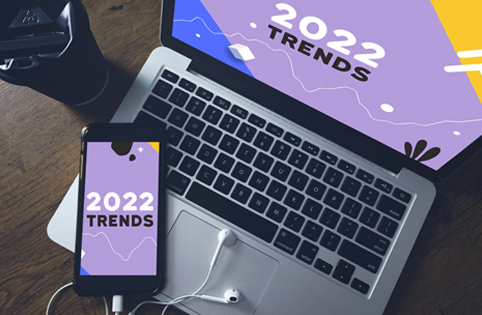
As a learner, did you ever face a situation where you felt that a course had nothing new to offer? Information is illustrated in a very predictable fashion? This is a common plight for everyone and for an eLearning designer as well. While designing a course or training material, one gets stuck with the same old style guide that the client provides and does not get enough freedom to experiment.
Visual design affects several aspects of learning. It particularly helps to concretize the learning by providing a memorable experience. Therefore, e-Learning designers must be attentive to current design trends that will safeguard the courses from becoming lifeless. In this article, we will explore the top five trending visual design elements, which can serve to be very useful across organizations to implement in their e-learning initiatives. The following trends will probably be a good idea to incorporate into your eLearning courses!
Color
A designer must be familiar with the psychology of colors as colors are the key drivers of attractive designs. Designers must skillfully manipulate human perceptions and shift them to the product’s advantage.
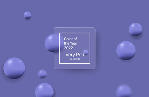
Pastels are associated with calmness and purity. Pale colors have the most impact when used in combination. Minimalist interfaces in muted colors are clean and communicate a friendly atmosphere. Pastels do an honest job when used as a ‘canvas’ for the elements that you want to be conspicuous. They fall back and support the user’s focus on the highlighted image. The popup color of 2022 is Pantone 17–3938 Very Peri, which is described as dynamic periwinkle blue hue with a vivifying violet-red undertone.
Neons are attention-grabbing. They enhance interface elements where required and scream the message aloud. To avoid a color clash, neon should only be used as accents. We should not overuse the interface as the viewer could feel swamped. It is fashionable for its vibrant colors and contrasting shapes.
Glassmorphism
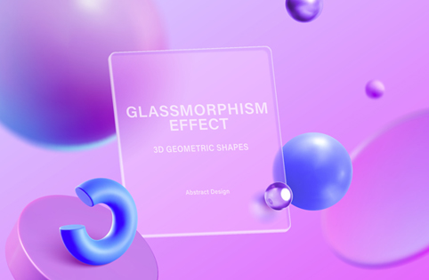
Glassmorphism is a popular design aesthetic that is most frequently found in UI design, in which background frames, icons, or buttons are built to appear like “glass” by blurring the elements behind them but still allowing some aspects of shape, light, and color to show through.
These elements, when applied correctly, may produce a very sleek, modern look. It can also assist the UI merge into the background, giving the user a sense of depth and immersion. This style was popularized by the iOS7 design system but has seen a recent rejuvenation since last year. Be careful not to overuse this technique because glassmorphism can make a UI design more confusing, making everything transparent, blurry, and out of context. This type of design creates additional muted colors and muted tones in your design. Be aware of the effect muted color palettes will have on the visual experience.
Minimalism
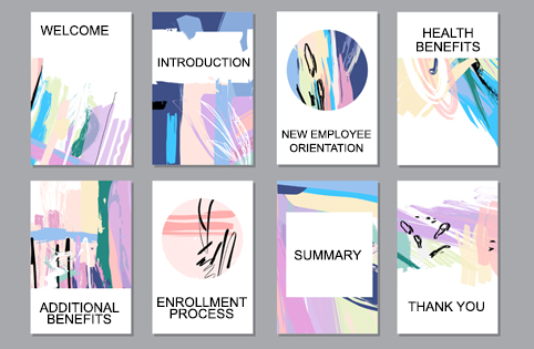
The idea is to create designs with the simplest shapes, forms, and the fewest colors and elements feasible. They may appear easy at first glance, yet they require a lot of brainstorming. A minimal design keeps users focused on their goals and provides them with the most relevant information that they need. It is a combination of white space, color, photos or illustrations, and shapes or patterns used intuitively.
Scrollytelling
We’re observing the appearance of a new “scrollytelling” approach as an alternative to traditional scrolling across a landing page. This technique tells a complete story in a long-form format. Designers may utilize a variety of creative solutions to surprise and engage the users in order to make this experience more spontaneous and engaging. Parallax effects, 3D elements, and detailed graphics make them explore the page with curiosity and enthusiasm. Scrollytelling is a fantastic way to increase onboarding, offer services on your website, and much more. This strategy is, however, rather difficult to create because each “chapter” of your story must be carefully studied and implemented.
Large Typography
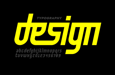
The attention of typography in web design is only going to grow. Large typography is one of the latest UI design trends raising words to the status of graphic elements that are a full-fledged part of the overall composition. Bold decisions regarding oversized typography allow for numerous experiments. They allow you to overlay text over photos or images, send powerful and immediately visible messages, experiment with alignments, or even fill the full screen with a single word.
Summary
The latest visual design trends resonate with our endeavor to find meaning in difficult times and to break out of what holds us down. The creators gain strength from all over the world with an open mind to craft mesmerizing designs with vivid colors, perfect imprecation, and futurism. Experimenting with design elements is becoming more and more imperative as information continues to be disseminated via technology. Therefore, identifying and implementing strategic visual design techniques in instructional design is integral to creating a sensational user experience for the learners.


